A Quick Look at BFC
2 min read
What is BFC?
BFC (Block Formatting Context) is an independent rendering region on a web page with its own set of rules:
- Boxes inside it stack vertically, one after another.
- Adjacent elements within the same BFC have their vertical margins collapse.
- A BFC region won't overlap with floated elements.
- When calculating a BFC's height, floated children are included.
How to create a BFC?
Any of these will create a BFC:
.bfc {
  /* 1. float other than none */
  float: left;

  /* 2. position absolute or fixed */
  position: absolute;
  position: fixed;

  /* 3. display set to inline-block, flex, grid, etc. */
  display: inline-block;
  display: flex;
  display: grid;

  /* 4. overflow other than visible */
  overflow: hidden;
  overflow: auto;
  overflow: scroll;

  /* 5. the recommended way: flow-root */
  display: flow-root;
}
Where BFC shows up
1. Clearing floats
When children are floated, the parent's height collapses. Creating a BFC fixes this:
<div class="container">
  <div class="float-box">I'm a floated box</div>
</div>

<style>
.container {
  border: 2px solid #333;
  /* create a BFC */
  display: flow-root;
}

.float-box {
  float: left;
  width: 200px;
  height: 100px;
  background-color: #f0f0f0;
  margin: 10px;
}
</style>
Result: the parent contains the floated child and its height doesn't collapse.
2. Preventing margin collapse
In normal document flow, adjacent elements' margins collapse. Wrapping one in a new BFC prevents that:
<!-- margins collapse -->
<div class="box blue"></div>
<div class="box red"></div>

<!-- use BFC to prevent collapse -->
<div class="box blue"></div>
<div class="bfc">
  <div class="box red"></div>
</div>

<style>
.box {
  width: 100px;
  height: 100px;
  margin: 20px;
}

.blue {
  background: blue;
}

.red {
  background: red;
}

.bfc {
  /* create a new BFC */
  display: flow-root;
}
</style>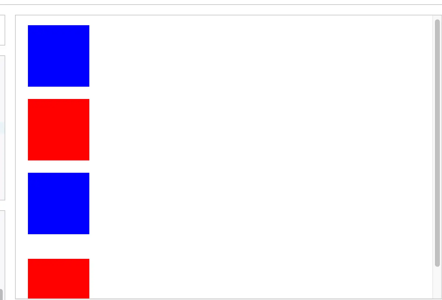
3. Adaptive two-column layout
Using "a BFC region won't overlap with floats," you can build an adaptive two-column layout:
<div class="layout">
  <div class="left">left fixed width</div>
  <div class="right">
    a long line of text a long line of text a long line of text<br/>
    a long line of text a long line of text a long line of text<br/>
    a long line of text a long line of text a long line of text<br/>
    a long line of text a long line of text a long line of text<br/>
    a long line of text a long line of text a long line of text<br/>
  </div>
</div>


<style>
.layout {
  background: #f0f0f0;
}

.left {
  float: left;
  width: 200px;
  background: #ff9999;
  padding: 20px;
}

.right {
  /* comment this out to see the difference */
  display: flow-root;
  background: #99ff99;
  padding: 20px;
}
</style>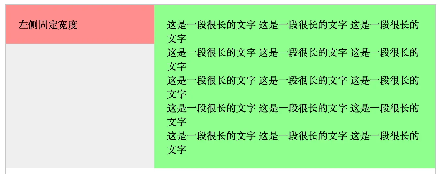
Best practices
-
Prefer
display: flow-root- It's the cleanest approach, designed specifically for creating BFCs.
- No side effects (unlike
overflow: hidden, which can hide content). - Clear semantics, easier to maintain.
-
Avoid
overflow: hidden- It's a common workaround, but it risks hiding content.
- If you have to use it, leave a comment explaining why.
-
Use BFC sensibly
- Don't overuse it.
- For simple layout problems, prefer modern layout tools first (Flexbox, Grid).
Wrap-up
BFC is a key concept in CSS — it provides an isolated layout context that solves a lot of common layout problems. Used properly, it lets you:
- Clear floats and prevent parent height collapse.
- Prevent margin collapse.
- Build adaptive two-column layouts.