CSS Fundamentals: Grid Layout (Part 2)
Intro: ✍️ Welcome back to the grid layout chapter. This post continues with grid layout — filling in what I left off last week.
Just got back to school this week, but the weekly post continues. Logging the learning process.
1. CSS Grid properties
Grid Container
-
display: marks an element as a grid container and creates an independent grid layout context for its contents. In short, the children inside the element get arranged according to the grid layout.grid: generates a block-level grid.inline-grid: generates an inline-level grid.
.container { display: grid | inline-grid; } -
grid-template-columns & grid-template-rows: a space-separated list of values that defines the columns and rows. The values are the row/column sizes, and the spaces are the grid lines.<track-size>: a length, percentage, orfrunit representing a fraction of the remaining space.<line-name>: any name you choose.- Details
.container {
  grid-template-columns: ... ...;
  /* e.g.
    1fr 1fr
    minmax(10px, 1fr) 3fr
    repeat(5, 1fr)
    50px auto 100px 1fr
*/
  grid-template-rows: ... ...;
  /* e.g.
    min-content 1fr min-content
    100px 1fr max-content
*/
}
Grid lines are auto-numbered (with -1 as an alias for the last line).

OK, talk is cheap, see the code.
Example
.grid-container { display: grid; grid-template-rows: 100px 200px; /* two rows, 100px and 200px tall */ grid-template-columns: 1fr 2fr; /* two columns, ratio 1:2 */ grid-gap: 10px; /* 10px gap between grid items */ } .grid-item { background-color: #ddd; padding: 20px; }<div class="grid-container"> <div class="grid-item">Grid Item 1</div> <div class="grid-item">Grid Item 2</div> <div class="grid-item">Grid Item 3</div> <div class="grid-item">Grid Item 4</div> </div>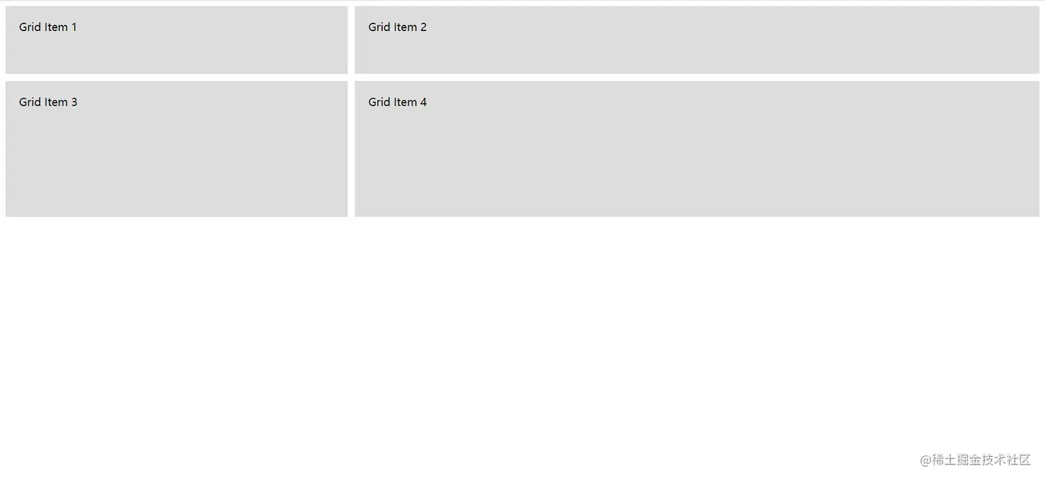
-
grid-template-areas: name your grid areas and reference those names in the grid template to define the structure. It makes the layout much clearer to read.<grid-area-name>: the name of an area defined withgrid-area..: a period represents an empty grid cell.none: no grid areas defined.
.container {
  grid-template-areas:
    '<grid-area-name> | . | none | ...'
    '...';
}
Example
.grid-container { display: grid; grid-template-areas: 'header header' 'sidebar main'; grid-gap: 10px; } .header { grid-area: header; background-color: #f2f2f2; padding: 20px; } .sidebar { grid-area: sidebar; background-color: #d9d9d9; padding: 20px; } .main { grid-area: main; background-color: #e6e6e6; padding: 20px; }<div class="grid-container"> <div class="header">Header</div> <div class="sidebar">Sidebar</div> <div class="main">Main Content</div> </div>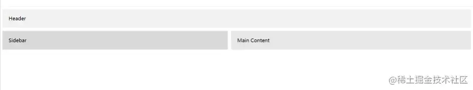
-
grid-template: shorthand forgrid-template-rows,grid-template-columns, andgrid-template-areas. -
column-gap & row-gap & grid-column-gap & grid-row-gap & grid-gap: easy ones — set column and row gaps.grid-gapis shorthand for both..container { /* standard */ column-gap: <line-size>; row-gap: <line-size>; /* old */ grid-column-gap: <line-size>; grid-row-gap: <line-size>; } .container { /* standard */ gap: <grid-row-gap> <grid-column-gap>; /* old */ grid-gap: <grid-row-gap> <grid-column-gap>; } -
justify-items & align-items: aligns grid items along the inline (horizontal) axis. (align-items, by contrast, is along the block — vertical — axis.) Applies to all grid items inside the container.- start
- end
- center
- stretch
- baseline (align-items)
.container {
  justify-items: start | end | center | stretch;
}
Example
.container {
  justify-items: start;
}
-
place-items: shorthand foralign-itemsandjustify-itemsin a single declaration. -
justify-content & align-content: similar to flex, but applies to the entire grid container.- start
- end
- center
- stretch
- space-around
- space-between
- space-evenly
.container {
  justify-content: start | end | center | stretch | space-around | space-between | space-evenly;
}
Example
.container {
  justify-content: start;
}
-
place-content: shorthand forjustify-contentandalign-content. -
grid-auto-columns & grid-auto-rows: sets the size of implicitly created grid tracks (column and row). -
grid-auto-flow: when grid items aren't explicitly placed, the auto-placement algorithm handles them. This property controls how the algorithm works.- row
- column
- dense
Example
.grid-container { display: grid; grid-template-columns: 100px 100px; grid-auto-flow: row; grid-gap: 10px; } .grid-item { background-color: #f2f2f2; padding: 10px; }<div class="grid-container"> <div class="grid-item">Item 1</div> <div class="grid-item">Item 2</div> <div class="grid-item">Item 3</div> <div class="grid-item">Item 4</div> <div class="grid-item">Item 5</div> </div>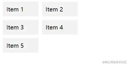
-
grid: a CSS shorthand that can set: explicit grid propsgrid-template-rows,grid-template-columns, andgrid-template-areas; implicit grid propsgrid-auto-rows,grid-auto-columns, andgrid-auto-flow; and gap propsgrid-column-gapandgrid-row-gap.
Grid Items
-
grid-column-start & grid-column-end & grid-row-start & grid-row-end: position a grid item by referencing specific grid lines.grid-column-start/grid-row-startis where the item starts;grid-column-end/grid-row-endis where it ends.<line>: a number to reference numbered lines, or a name to reference named lines.span <number>: span the given number of grid tracks.span <name>: span until you hit the next line with the given name.auto: auto placement, auto span, or default span of one.
.item {
  grid-column-start: <number> | <name> | span <number> | span <name> | auto;
  grid-column-end: <number> | <name> | span <number> | span <name> | auto;
  grid-row-start: <number> | <name> | span <number> | span <name> | auto;
  grid-row-end: <number> | <name> | span <number> | span <name> | auto;
}
Example
.item-a {
  grid-column-start: 2;
  grid-column-end: five;
  grid-row-start: row1-start;
  grid-row-end: 3;
}
-
grid-column & grid-row: shorthand forgrid-column-start + grid-column-endandgrid-row-start + grid-row-end.<start-line> / <end-line>
.item {
  grid-column: <start-line> / <end-line> | <start-line> / span <value>;
  grid-row: <start-line> / <end-line> | <start-line> / span <value>;
}
Example
.item-c {
  grid-column: 3 / span 2;
  grid-row: third-line / 4;
}
-
grid-area: gives an item a name so it can be referenced by a template created withgrid-template-areas. It can also act as a shorthand forgrid-row-start + grid-column-start + grid-row-end + grid-column-end(there's a demo above — scroll back). -
justify-self: simple — aligns the item horizontally within its grid cell.- start
- end
- center
- stretch
-
align-self: same idea — aligns the item vertically within its grid cell.- start
- end
- center
- stretch
Example

-
place-self: shorthand forjustify-selfandalign-self.
2. Special units and functions
fr units
In CSS Grid, you'll use fractional units like 1fr a lot. They essentially mean "a fraction of the remaining space." So a declaration like:
grid-template-columns: 1fr 1fr 1fr;means "split the available space evenly into three parts, each taking 1/3 of the remaining space." The columns end up equal in width and adapt to the container size.
Sizing keywords
When sizing rows and columns, you can use any length unit you know — pixels (px), rem, percentages (%) — plus a few keywords:
min-content: the minimum size of the content.max-content: the maximum size of the content.auto: sizes itself based on content. The grid item's size is determined by its content and doesn't directly participate in distributing remaining space.Fractional units: likefr.
Sizing functions
fit-content(): uses the available space, but never less thanmin-contentand never more thanmax-content.minmax(): sets a minimum and maximum length. Especially useful with relative units.
grid-template-columns: minmax(100px, 1fr) 3fr; // min 100px, max 1frthe repeat function and keywords
Example
grid-template-columns: 1fr 1fr 1fr 1fr 1fr 1fr 1fr 1fr;

/* easier: */
grid-template-columns: repeat(8, 1fr);auto-fit: fits as many columns into a row as possible, even if they're empty.auto-fill: fills all columns into the available space, expanding columns to fill space rather than leaving empty ones.
3. Wrap-up
Writing takes work — appreciate the support, haha. Tomorrow's Monday, hope everything goes well for everyone ^_^